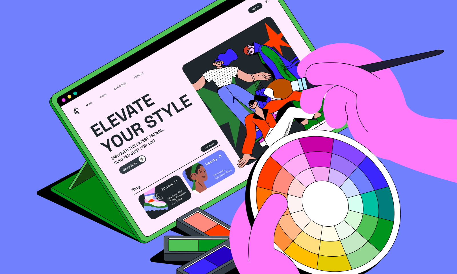
In the world of web design, colors are more than just aesthetic choices—they are powerful tools that influence user behavior, evoke emotions, and shape perceptions. The right color palette can make your website visually appealing, enhance user experience, and even drive conversions. This is where color psychology comes into play.
Color psychology is the study of how colors affect human behavior and decision-making. By understanding the psychological impact of colors, you can create a website that resonates with your audience and achieves your business goals. In this article, we’ll explore the role of color psychology in web design and provide actionable tips for choosing the right color palette for 2025.
Why Color Psychology Matters in Web Design
Before diving into the tips, let’s understand why color psychology is so important in web design:
- First Impressions: Colors are one of the first things users notice when they visit your website. They set the tone for your brand and influence how users perceive your site.
- Emotional Impact: Colors evoke specific emotions and feelings, which can influence user behavior and decision-making.
- Brand Identity: A consistent color palette reinforces your brand identity and makes your website memorable.
- User Experience: The right colors improve readability, navigation, and overall user experience.
Now, let’s explore how to use color psychology to choose the right palette for your website.
Understanding the Psychology of Colors
Different colors evoke different emotions and associations. Here’s a breakdown of the psychological impact of common colors:
Red
- Emotions: Passion, excitement, urgency.
- Use Cases: Call-to-action buttons, sales, and promotions.
- Example: Amazon uses red for its “Add to Cart” button to create a sense of urgency.
Blue
- Emotions: Trust, calmness, professionalism.
- Use Cases: Corporate websites, financial institutions, and healthcare.
- Example: Facebook and LinkedIn use blue to convey trust and reliability.
Yellow
- Emotions: Happiness, optimism, warmth.
- Use Cases: Creative industries, food, and entertainment.
- Example: McDonald’s uses yellow to evoke feelings of happiness and energy.
Green
- Emotions: Growth, health, nature.
- Use Cases: Eco-friendly brands, health and wellness, and finance.
- Example: Whole Foods uses green to emphasize its commitment to natural and organic products.
Purple
- Emotions: Luxury, creativity, spirituality.
- Use Cases: Beauty, fashion, and artistic brands.
- Example: Cadbury uses purple to convey luxury and indulgence.
Orange
- Emotions: Energy, enthusiasm, playfulness.
- Use Cases: Call-to-action buttons, entertainment, and youth-oriented brands.
- Example: Fanta uses orange to reflect its fun and energetic brand personality.
Black
- Emotions: Sophistication, elegance, power.
- Use Cases: Luxury brands, fashion, and technology.
- Example: Apple uses black to convey sophistication and innovation.
White
- Emotions: Simplicity, cleanliness, purity.
- Use Cases: Minimalist designs, healthcare, and technology.
- Example: Google uses white to create a clean and simple interface.
How to Choose the Right Color Palette for Your Website
Now that you understand the psychology of colors, here’s how to choose the right palette for your website:
1. Define Your Brand Identity
Your color palette should reflect your brand’s personality and values. Ask yourself:
- What emotions do you want to evoke?
- What is your brand’s mission and vision?
- Who is your target audience?
For example, a tech startup targeting young professionals might choose a modern palette of blue and gray, while a wellness brand might opt for calming greens and whites.
2. Consider Your Audience
Different demographics respond differently to colors. For example:
- Young Audiences: Bright, bold colors like orange and yellow can appeal to younger users.
- Older Audiences: Muted, sophisticated colors like navy blue and burgundy may resonate more with older users.
- Cultural Differences: Colors have different meanings in different cultures. For example, white symbolizes purity in Western cultures but represents mourning in some Eastern cultures.
3. Use the 60-30-10 Rule
The 60-30-10 rule is a classic design principle for creating balanced color schemes:
- 60% Dominant Color: This is the primary color that sets the tone for your website (e.g., background color).
- 30% Secondary Color: This color complements the dominant color and is used for elements like headers and buttons.
- 10% Accent Color: This is a bold, contrasting color used for call-to-action buttons and highlights.
For example, a website might use white as the dominant color (60%), blue as the secondary color (30%), and orange as the accent color (10%).
4. Ensure Readability and Accessibility
Colors should not only look good but also ensure readability and accessibility. Here’s how:
- Contrast: Use a contrast ratio of at least 4.5:1 for text and background colors to ensure readability.
- Accessibility: Follow Web Content Accessibility Guidelines (WCAG) to make your website accessible to users with visual impairments.
- Test Colors: Use tools like WebAIM’s Contrast Checker to test color combinations.
5. Test and Iterate
Once you’ve chosen a color palette, test it with real users to see how they respond. Use A/B testing to compare different color schemes and determine which one performs best.

Trending Color Palettes for 2025
Here are some trending color palettes to inspire your web design in 2025:
1. Earthy Tones
- Colors: Olive green, terracotta, and beige.
- Use Cases: Eco-friendly brands, wellness, and lifestyle.
2. Neon and Pastel
- Colors: Neon pink, pastel blue, and lavender.
- Use Cases: Creative industries, fashion, and youth-oriented brands.
3. Monochrome
- Colors: Shades of a single color (e.g., different shades of blue).
- Use Cases: Minimalist designs, technology, and corporate websites.
4. Bold and Vibrant
- Colors: Bright red, electric blue, and sunny yellow.
- Use Cases: Entertainment, food, and e-commerce.
High-Authority Links for Further Reading
- Adobe Color Wheel – https://color.adobe.com/
A tool for creating and exploring color palettes based on color theory. - Smashing Magazine – Color Theory – https://www.smashingmagazine.com/category/color-theory
A trusted source for insights and best practices in color theory and design.
Read More: How to Create a Landing Page That Converts: Web Design Tips for 2025
Conclusion
Color psychology plays a crucial role in web design, influencing user behavior, emotions, and perceptions. By understanding the psychological impact of colors and choosing the right palette, you can create a website that resonates with your audience and achieves your business goals.
From defining your brand identity and considering your audience to ensuring readability and testing your palette, every step plays a crucial role in creating a visually appealing and effective website. In 2025, embrace the power of color psychology and watch as your website becomes a more engaging and impactful tool for connecting with your audience.


